Neelesh Misra (A Hindi radio/audio storyteller)- Have you heard about him?
If yes- Then I am sure you would know how amazing he is at his work.
I fell in love with his voice, when I first heard him telling a story on the show he used to host on Radio fm-104.8 back in the 90s named- yaadon ka idiotbox.
His narration, the weight of his voice, the accent, the tone, and everything else, spoke millions of words behind the scenes, while on the front end, he only told a simple story with mind-blowing emotions that hit the right chords of listeners at the right times.
Even today, if I get to hear him, he holds me mesmerized and I don’t stop until the story finishes.
That’s the impact he had on me.
If you don’t know him, I would highly recommend you to hear one of his stories.
You can also check out his complete profile at https://neeleshmisra.com/
Now, why are we talking about a storyteller when we are learning about brand fonts?
The relation among them is simple- Just like Nilesh Misra or any one of us, we have our own style of speaking.
Some of us sound Bold and Confident. Some of us sound Sweet and Humble while some of us even sound Confused and Imbalanced.
When someone says anything, if choosing the right words is important, then the right style (accent) to say them is equally important.
How do you know the accent of a brand?
A brand accents itself through Fonts and Typography.
A simple example-
Both of these, convey the same thing, the only difference is in the way they speak (Their fonts/type).
The first greets professionally or formally, while the other greets in a casual or friendly way.
That’s the impact fonts of a brand leave on the minds of people.
What type of fonts do you use for a business brand?
Well, it depends on the business you are running.
The choices can seem overwhelming, BUT it’s essential to understand the different types of fonts and their implications for branding.
Imagine you want a relaxing day and are on a spree for comfort, to soothe your mind and body.
You search for a spa near you and come to this:
Won’t you run for your life?
Or
Let’s take another example-
You are looking for a financial consultant to help you invest your hard-earned money.
How about his brand plate showing this👇
Would you trust them?
How would you trust someone with your money who does not take his job seriously?
Hence, your niche decides the font to be used for your brand.
However, to make your job easier here is a list of four types of most popular brand fonts that usually go well with almost all kinds of Businesses (ALMOST)
Serif-
Serif fonts, with their embellished strokes, convey a sense of tradition, authority, and reliability, making them suitable for established brands or those aiming for a classic appeal.
Sans-serif-
Sans-serif fonts, on the other hand, exude modernity, simplicity, and minimalism, often favored by tech companies and contemporary brands.
Script-
Script fonts emulate handwritten or calligraphic styles, adding a touch of elegance, warmth, and personality, ideal for luxury brands or those seeking a more intimate connection with their audience.
Display-
Display fonts are decorative and highly stylized, best used sparingly for emphasis or creative purposes in branding materials.
Why is choosing the right font/type for a brand important?
Choosing the right font for a brand is more than just a visual decision; it’s a strategic move for your brand perception and recognition.:
- It’s An Emotional Connection:
Fonts play a vital role in how consumers connect with a brand on a subconscious level.
- Provides Consistency and Recognition:
Maintaining consistency in font usage across various platforms enhances brand recognition and establishes coherence in the brand’s visual identity.
- Reinforces Brand Values:
Fonts reinforce a brand’s values, personality, and positioning, aligning them with the intended brand image.
- Shapes Brand Experience:
The choice of fonts shapes the overall brand experience for consumers, influencing their perception and interaction with the brand.
- Competitive Differentiation:
Selecting the right font is crucial for standing out and differentiating your brand from your competitors.
- Leaves A Memorable Impact:
A well-chosen font can make a brand more memorable, appealing, and impactful, leaving a lasting impression on consumers.
How to choose fonts for your brand? (A 6-STEP GUIDE)
Choosing the perfect font is for sure harder than choosing an ice cream flavor at an ice cream parlor.
So where should you start?
Step 1: Know your personality
Before you choose a font, you must first understand your brand’s identity.
Your identity requires personality in terms of how it relates to your target audience.
You could choose from the following list:
Accessible Approachable Bold Calm Casual Cheerful Classic Conservative Contemporary Convenient | Cool Creative Custom Cutting Edge Delightful Easy Efficient Elegant Energetic Exclusive | Familiar Flexible Formal Fresh Friendly Fun Functional Human Informal Innovative | Inviting Mature Modern No-Nonsense Personable Plain Playful Polished Professional Quirky | nique Reliable Secure Serious Sincere Sophisticated Trustworthy Unconventional Versatile Warm |
STEP 2: Understand font traits:
Font psychology refers to the classification of fonts based on personality qualities.
You should obviously explore which font categorization best suits your brand.
Here are some basic font classifications.
– Serif – Classic Traditional, Trust-worthy
– Sans Serif – Modern, Minimal, Clean
– Slab Serif – Bold Quirky, Confident
– Script – Elegant and Unique
– Handwritten- Informal and Artistic
– Decorative – Stylish, Distinctive, Dramatic
Step 3- Budget and Licensing:

Before you get started, you should figure out how you’re going to receive your fonts.
Do you have a budget for a premium font family, or are you looking for free alternatives?
Here is a list of some high-quality font libraries:
Free Font Sites:
(Here you can get brand fonts free of cost)
- Google Fonts
- Font Squirrel
- Font Library
Paid Font Sites:
- Adobe Fonts
- Linotype
- Fonts
(Search for these sites on Google and it will lead you to their respective pages)
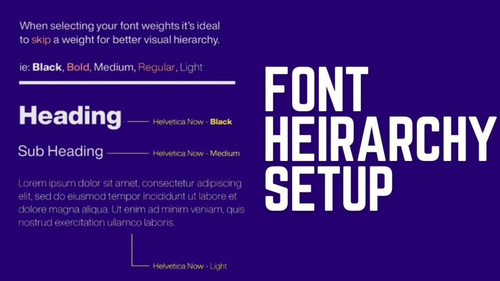
Paid fonts often provide additional versatility to your brand with several font weights– thin, light, regular, bold, and black.
STEP 4: Pick your pairs:
Once you’ve identified your brand’s personality and classification, you’ll most likely require a pairing font for your logo and other branding touchpoints.
Some of the Font Pairing Examples that you would want to check out are:
Modern & Trustworthy Pairings (Modern Brand fonts):
Abril Fatface (header), Montserrat (subheader)
Rozha One (header), Raleway (subheader)
Sleek & Professional Pairings (Iconic Brand Fonts):
Economica Bold (header), Economica Regular (subheader)
Montserrat Regular (header), Montserrat Bold (subheader)
Youthful & Friendly pairings (Cool Brand Fonts):
Quicksand Bold (header), Open Sans (subheader)
Fredoka One (header), Montserrat (subheader)
High End & Elegant Pairings (High-End Brand Fonts):
Forma DJR Display (header), Besley Book Italic (subheader)
Condor Wide Regular (header), Playfair Display Italic (subheader)
STEP 5: Check Font Weights
Different font weights are necessary for creating a clear text hierarchy.
It’s essential that they’re easy to understand and appear decent when locked up in various scenarios.
STEP-6: Test The Touchpoints
Now that you have your fonts outlined with their weights, you want to test them on all your brand touchpoints.
Be sure to check all the font license requirements for your packaging, website, print, etc.
Here is a list of things you may want to test the fonts on:
| • Websites • Packaging • Letterheads • Billboards • Stationary | • Banners • Products • Direct Mails • Social Content • Email Artwork | • Advertisements • Flyers • Store front • Posters • Merchandise |
How many fonts should a brand have?
The basic rule of thumb states that your brand should have 2 fonts and at the max 3- to retain consistency while allowing for flexibility.
Here’s a breakdown of the recommended method:
Primary Font:
Every brand should have a primary font that acts as the main typeface. This font is commonly used for logos, headlines, and prominent text on many brand items.
Secondary font:
In addition to the primary typeface, you can use a secondary font to add diversity and flexibility. The secondary font can be used for subheadings, captions, and other supporting text, adding contrast while remaining consistent with the overall brand look.
Accent Font:
Some brands may choose to use accent typefaces for special occasions or purposes. These accent fonts can add flair or personality to particular communications, but they should only be used sparingly to prevent diluting the brand’s image.
Frequently Asked Questions:
What type of fonts make a brand feel respectable and reliable?
Serif fonts convey a sense of tradition and reliability, making them ideal for brands seeking respectability.
How many fonts does a brand need?
A brand typically needs only two fonts for consistency and versatility in design. Want to take an extra mile, then add a third one occasionally?
Name the most popular brand fonts used by businesses today.
Some popular brand fonts include San Francisco (used by Apple), Product Sans (used by Google), and Gotham (used by Netflix).
Signing Off-

With each font chosen, you’re not just making a visual decision; you’re shaping the narrative of your brand, crafting its identity, and forging connections with your audience. So, take heed and make your brand font speak volumes, leaving a lasting impression that beckons action and loyalty from all who encounter it.
Don’t want to take the headache but want a super awesome brand identity?
Connect with us now.
Also read- https://visualsthatspeak.com/what-is-visual-branding/
